The marks, and how to use them.
Everything needed to represent abatchan correctly: the name, the statement, the symbol, the lockups, the colour system, and the type scale. Files are linked where they are described.
One word, always lowercase.
The lowercase treatment is deliberate. It carries calm confidence and premium simplicity, and it stays consistent everywhere the brand appears.
- display name
- abatchan
- legal name
- ABATCHAN LTD
- never
- Abatchan · ABATCHAN · Abat Chan
What the brand says.
abatchan is a modern engineering brand focused on building connected digital systems through scalable infrastructure, intelligent design, and clean execution.
If it plugs in, I build it.
- Modern systems. Clean execution.
- Infrastructure for modern workflows.
- Engineered to connect. Built to scale.
- From interface to infrastructure.
Mirrored, open geometry.
Built from the letters in “aba”, the symbol reads as connection, modular systems, and the relationship between frontend and backend. It is balanced, and it can expand.
Symbol plus wordmark.
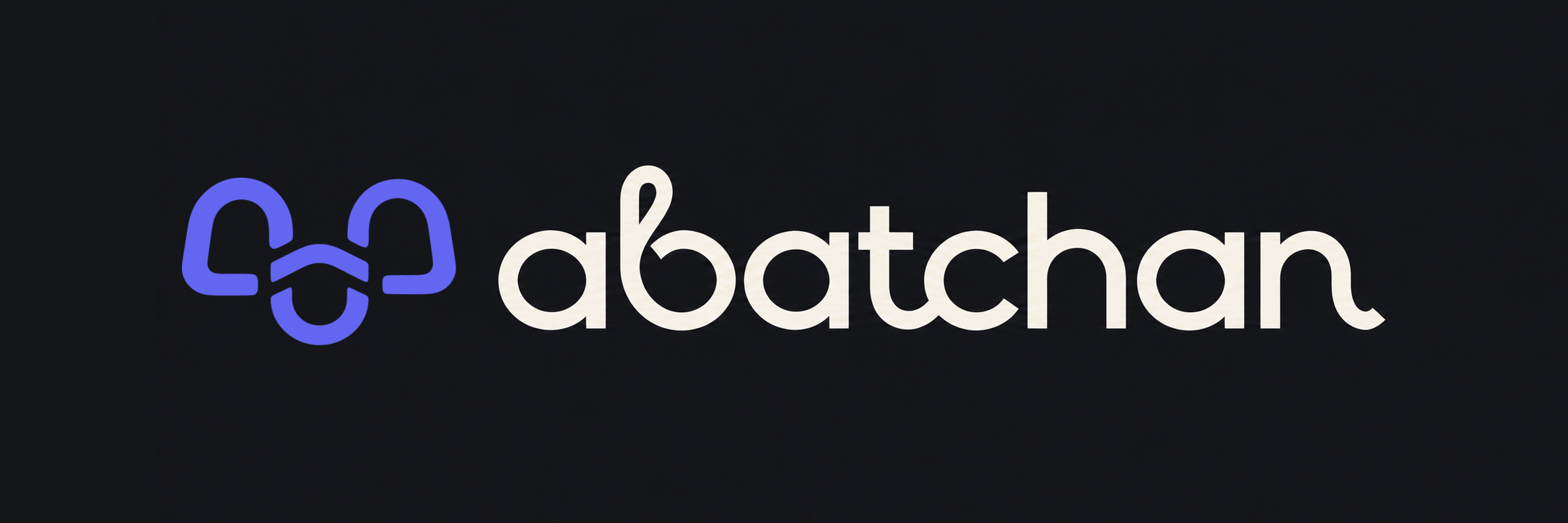
The horizontal lockup is the primary form. The symbol stays indigo in both; only the wordmark changes so the mark never shifts colour with the background. The curly lockup is an expressive secondary variant for campaign and editorial moments.

Two carry it, one signals.
Black and soft white do most of the work. Indigo is a signal, not a background theme, and no other accent is introduced unless a product interface needs semantic states.
- Primary Black
#0D0D0D
Dark backgrounds, UI foundations, premium surfaces, video backgrounds.
- Soft White
#F5F5F3
Primary type on dark backgrounds, light surfaces, logo contrast.
- Accent Indigo
#6366F1
Active states, key interaction points, signal dots, links, restrained glow.
#4F46E5 for body-size text so it stays readable.Geist, with intent.
Geist carries the interface, primary wordmark, and body copy. The custom curly lettering is reserved for the expressive secondary lockup. Satoshi remains available for editorial and campaign moments.
The short version.
If a use is not covered here, keep the mark legible, keep the space around it, and leave the geometry alone.
Do
- Use the white mark on
#0D0D0Dbackgrounds. - Use the black mark on
#F5F5F3or white backgrounds. - Keep clear space of at least one inner curve width on all sides.
- Use indigo as an accent or a final motion state.
- Reach for the symbol alone at small sizes: avatars, favicons, app icons.
Don’t
- Stretch, rotate, or otherwise distort the mark.
- Recolour it outside the three brand colours.
- Add drop shadows, outlines, or effects.
- Place it on busy media without enough contrast.
- Rebuild the wordmark by typing it · use the supplied lockup.
Need something not listed here?
Ask for the asset you need and it will be sent in the right format, or prepared if it does not exist yet.